
A poster made for a UX Design club at Sheridan College.
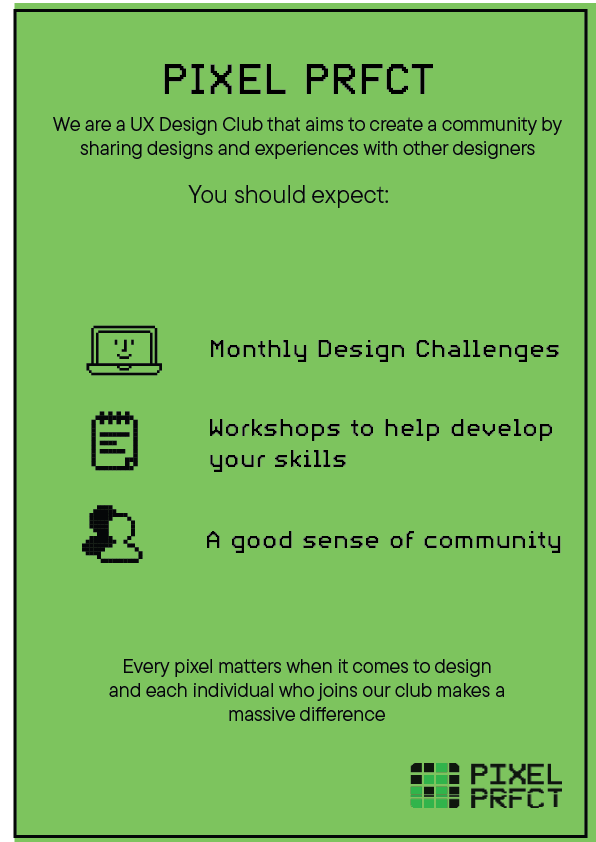
Initial Ideas
I had made a basic initial layout to get a general idea of the aesthetic, fonts and color schemes I would eventually use.
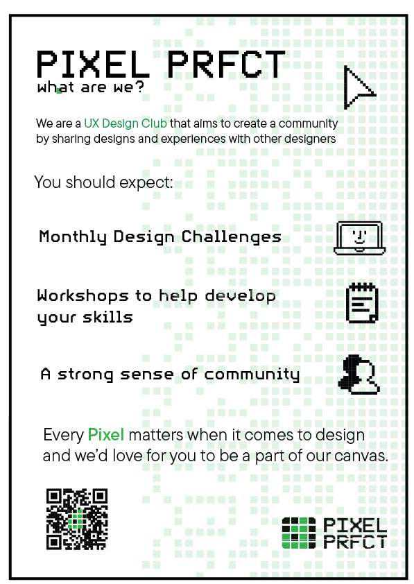
Backgrounds and Layout Improvement
after making the initial layout, a few more subtle elements were added in order to make the design pop out more; giving the readers an easier path down the poster in order to give a reason to
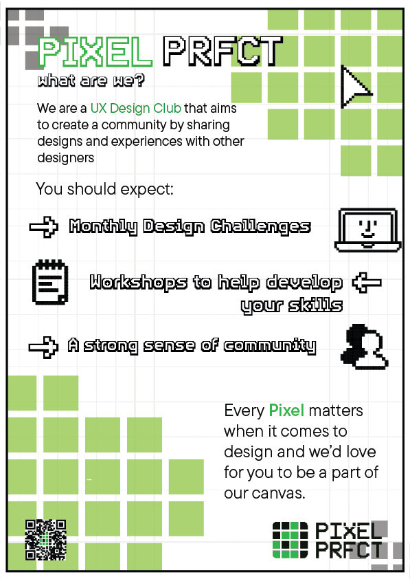
Final Design
After some feedback from peers and doing a coworking session to make some more tweaks and adjustments, I eventually landed on this design. The text in the middle and in the headings was adjusted to be a bit more stylized to be a retro-like aesthetic, really sticking with the idea of pixels. The background was changed to include the background pixels in a less crowded way that still draws eyes.

Leave a comment