STEAM REPLAY; REIMAGINED
Reimagining Steam’s Year in Review with deeper insights and interactive storytelling.
Overview
Steam Replay provides insights into user’s yearly gaming activity, providing key insights into categories such as top genres, most played games by total playtime, and month to month trends.
With an estimated monthly user base of over 185 Million active users, each recap should feel like a personalized, interactive showcase of a player’s unique gaming habits and behaviors throughout the year. When compared to other examples of yearly recap features in media as well as looking into user feedback, Steam replay lacked interactivity, depth, and a cohesive presentation. These concerns highlighted the need for a more interactive, narrative driven re-design.
Research
To inform my decision making, I used a variety of research methods, including interviews, surveys and user testing. These approaches led me to discover key insights which helped drive the direction of the project, several of which will be highlighted below.
The research conducted focused on 2 main areas; how users think about the ways their data is collected and displayed, and how people track and reflect on their gaming habits. While data is constantly being collected, it is not something that users prioritize or think about often unless it is presented in a practical fashion. Understanding how subconscious thoughts and attitudes shape the way users digest data and what they prioritize was crucial in deciding what data resonates the most with users and how it should be displayed.
Surveys
To collect data, I sent out a survey to potential users about gaming habits, data collection and Yearly recap features to gain more insight into how users interact with gaming related data and how it influences their experiences. Below were some key insights gained:
- In-Depth personalized Statistics was the main feature participants prioritized when looking at Year in Review applications
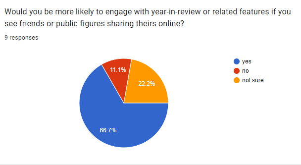
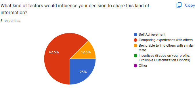
- 62% of participants were influenced to share their data mainly to compare their experiences with others
- Participants would be more influenced to interact with Year in review features if they saw others sharing their data first.
Interviews
I conducted interviews with potential users who have a history with gaming to gain insights on data collection so I could be informed on what kind of information users would be the most interested in seeing. Of these interviews, these were some of the most notable insights and quotes gained:
- Users prefer to see their data presented in a fashion that’s personalized towards their own interests and information
- Users would find stats that are specifically related to things that happen in game more interesting than the more general stats
- Users like sharing data as a way to showcase their commitment or dedication to the games they play; like showing off a badge of honor to others
Main Takeaways
Of the research I conducted, these were the key insights I gained:
- Make the experience personalized towards each user’s specific interests
- Users are motivated to interact with their data by being able to compare and contrast experiences with others.
- Game specific stats and metrics are a very important inclusion.
With these insights in mind, the best direction to take this project in was to re-design the experience to not only be more engaging, but to provide users with a sense of community in order to encourage them to think more about the ways that data could enhance and influence their gaming activity, as well as making the experience resonate more on a personal level with stats catered to user’s specific experiences.
The Process
To inform my decision making, I used a variety of research methods, including interviews, surveys and user testing.These approaches led me to discover key insights which helped drive the direction of the project, several of which will be highlighted below.
The research conducted focused on 2 main areas; how users think about the ways their data is collected and displayed, and how people track and reflect on their gaming habits. While data is constantly being collected, it is not something that users prioritize or think about often unless it is presented in a practical fashion. Understanding how subconscious thoughts and attitudes shape the way users digest data and what they prioritize was crucial in deciding what data resonates the most with users and how it should be displayed.
Early Prototyping
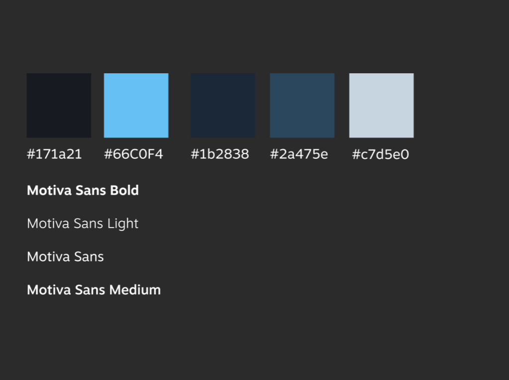
The visual system follows Steam’s established design standards, primarily using Motiva Sans with weights such as light, regular, medium, and bold. The color palette is also consistent with Steam’s branding, relying on various shades of blue. I chose to work within Steam’s existing font system as I would not want to stray away from Steam’s aesthetics as it may look out of place..
This provided sufficient variety and hierarchy without introducing unnecessary complexity. As the design evolved, additional accent colors were introduced as part of background treatments, meaning some of the original palette was later adjusted.
Prototyping – Screens
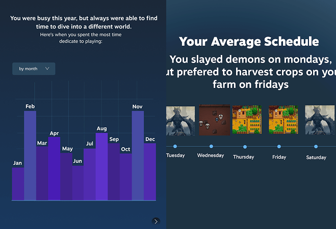
When creating the initial prototypes, I stay heavily within the confines of Steam’s usual colors and aesthetics while still adding a creative touch here or there to keep my designs consistent. I relied heavily on blues and purples for much of the graphical elements, using mostly white and greys for the text.
While this worked well for testing purpose, the aesthetics lacked flair and would leave much to be desired if they were left as is. It is important to have a mix of both continuity to the brand, but also a little bit extra to make it stand out.
Prototyping – Interactivity
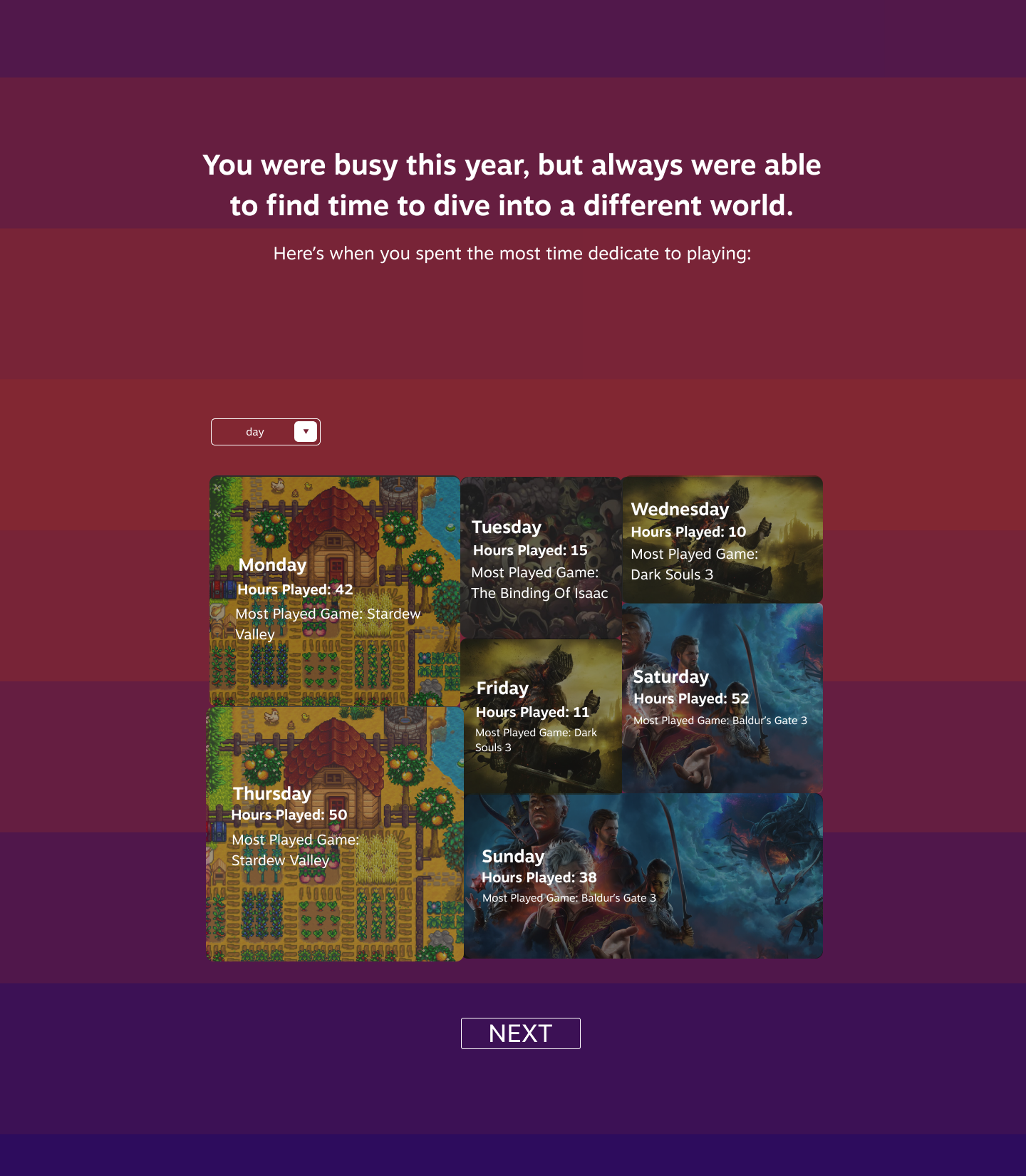
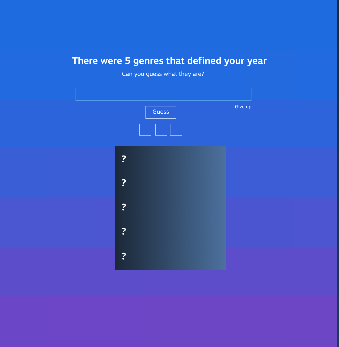
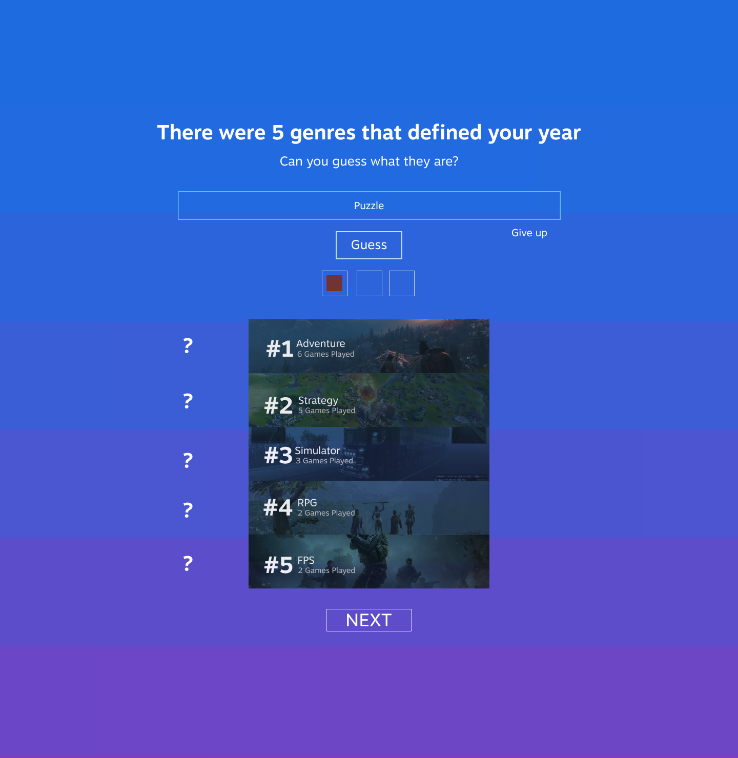
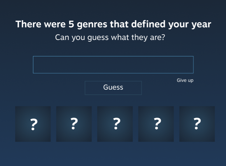
One of the aspects I wanted to add in order to enhance the overall experience was to add some kind of interactivity since the original Steam Rewind consisted of a mostly static page you scrolled down. Originally the section which showed your most played genres was a graph; which there were already plenty of. Turning it into a guessing game might incentivize users into sharing the features with others.
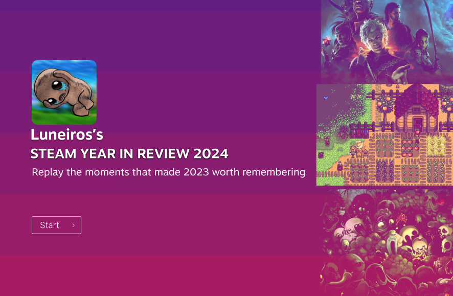
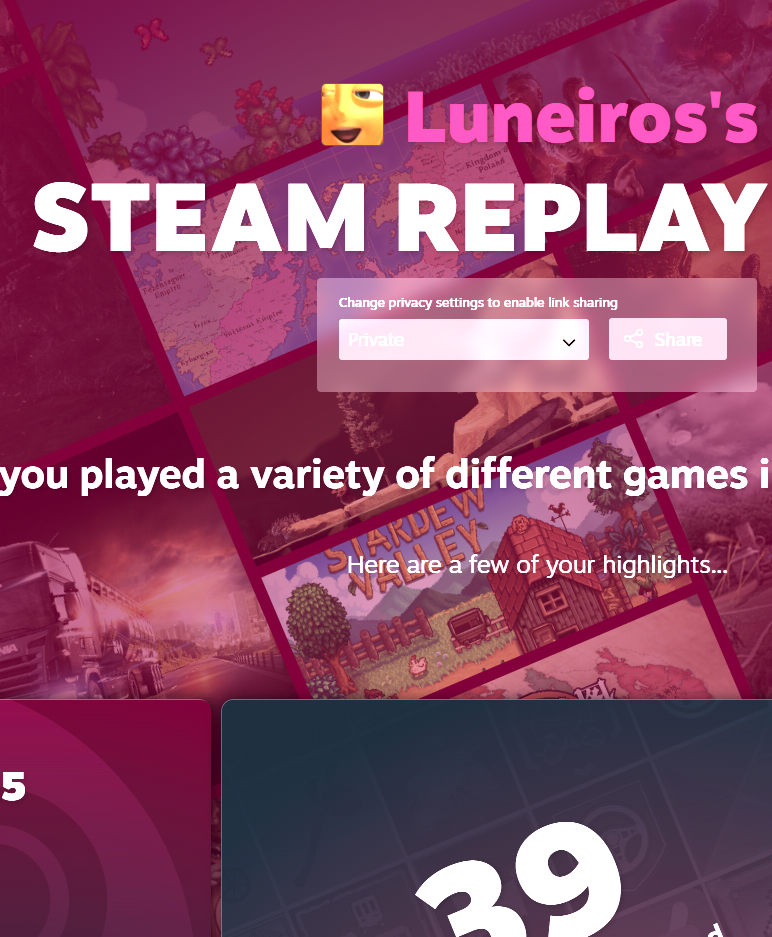
Final Product
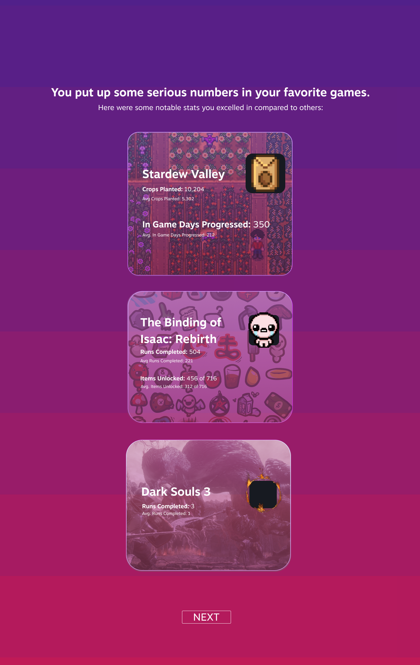
The final product ended up changing the design from that of a static page that you scroll down to an interactable format where you are shown each screen one at a time; emphasizing the importance of each personalized statistic instead of just treating it like a large chunk of information to be glanced at .The overall designs combines aspect of Steam’s regular branding, mixed in with some more vibrant colors and nostalgic graphic styles that gamers would be familiar with. More specific game statistics and a wider, more customized range of user metadata gives each user a unique perspective into their habits and playstyle. It tells a narrative of the user’s year in gaming while also being engaging and informative.